
Application of Pareto analysis & Fishbone diagram in Apparel Industry
Pareto analysis and Fishbone ( Cause and Effect Diagram) are very popular and useful for quality control in the apparel industry. Pareto analysis and Fishbone diagram are the most important among all the 7 QC tools, very important for controlling quality in the apparel manufacturing industry. This article discusses the two most popular quality control tools in detail: the Application of Pareto analysis and the Fishbone diagram in the apparel industry.
Practical problem solving process by Application of Pareto analysis & Fishbone diagram in Apparel Industry:
Pareto Analysis
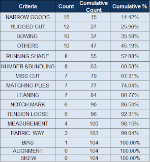
Pareto is a simple statistical chart, also known as Pareto diagram or Pareto analysis, but it is very useful for quality control. A Pareto chart looks like a cumulative bar graph. The length of the bars represents frequency or cost (Time or money) and are arranged with the longest bars on the left and the shortest to the right. The longest bar represents the most vital cause. Pareto analysis is a statistical data analysis technique, decision-making tool, and Six Sigma quality tool, an effective problem-solving technique. The
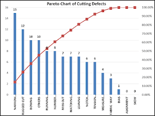
A Pareto chart shows quality results by sorting defects from top to bottom. Nowadays, Pareto analysis is becoming popular in the garment manufacturing industry. We get the top defects percentage and cumulative defect percentage in the Pareto chart, a decision can be made easily, reduce defects and can trace improvement easily.
PARETO Fundamentals
Pareto analysis was named after the Italian economist, Vilfredo Pareto. The original observation was in connection with population and wealth. Pareto observed that 80% of Italy’s land was owned by 20% of the population. In the late 1940s, Dr. Joseph M. Juran, a Quality Management pioneer, applied this 80/20 Rule to quality control, calling it Pareto’s Principle. Pareto Principle, The 80/20 rule or A vital few and a little many.
Steps of making /creating Pareto chart/Pareto graph in Excel Spreadsheet
- Open the Microsoft Excel spreadsheet.
- Collect the raw data you want to measure.
- Sort your data from largest to smallest.
- Sum to get the total quantity.
- Create a column of %.
- Create a column of cumulative %.
- Highlight your data to create a chart
- Press ALT and F1
- Select data and remove column of %
- Finally, change the type of graph for cumulative
Fishbone diagram
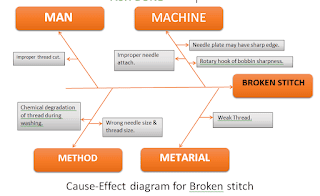
There must be many potential reasons or causes that ultimately lead to creating a defect. A defect is a quality problem. Cause and effect analysis is a tool for analyzing and illustrating a process by showing the main causes and sub-causes leading to a defect. It is sometimes referred to as the “Ishikawa diagram” because Kaoru Ishikawa developed it and the “fishbone diagram” because the complete diagram resembles a fish skeleton. The fishbone is easy to construct and invites interactive participation.
A fishbone diagram is also called a ” cause and effect diagram’ or Ishikawa diagram, which identifies all possible root causes behind a problem or defect, one of 7 QC tools. If you can identify all the reasons behind a defect, you can easily work to reduce or remove it by taking some corrective action against the defect. Need involvement of related quality control team and production team when making fishbone diagram, should it be in the place where a problem occurs. A fishbone diagram needs to be done for every individual defect in the garment manufacturing factory.
Fishbone fundamentals
The fishbone diagram identifies many possible causes for an effect or problem. It can be used to structure a brainstorming session. It immediately sorts ideas into useful categories. Doctor Kaoru Ishikawa is best known for the development of the Fishbone, also known as a cause-effect diagram. Brainstorm the major categories of causes of the problem, Fishbone works based on causes are Method, Machine, Manpower (People), Materials, Measurement, Management, and Environment.
When to use the FISHBONE
- When identifying possible causes for a problem.
- Especially when a team’s thinking tends to fall into ruts.
- To generate ideas in an orderly way
- When you want to eliminate the cause
- When you need a structured approach rather than some other tools for brainstorming causes of a problem
Steps of Making a cause and effect diagram
- Define the effect of the problem
- Define the multitask team according to the problem
- Draw the diagram
- Put the effect on the right side
- Time for brainstorming and categorization of ideas
- Ask why as many times as needed
- Fill in the diagram
- Choose the most important causes with the team
- Make a Document to record it.
The application of Pareto analysis and Fishbone diagrams help the apparel industry to spot and fix major problems with quality, production, and processes. When you use Pareto analysis (to focus on big issues) with Fishbone diagrams (to find what’s causing problems), garment makers can solve production and quality issues well.